The “Container” is a category located in the first position of the “Styles” tab in the design pane. Every element, except “Code” has a “Container” category.
Customizing containers
A container acts like a box that frames your element. Thanks to it, you can apply a style which will automatically be assigned to the element concerned.

Some elements may be nested. So, make sure you apply the settings to the right element.
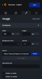
Most customization options are common to all elements with a container. If certain settings are not available, it's because the selected element doesn’t allow them to be applied.
The customization options in the “Container” category are divided as follows :
Width
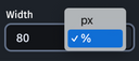
You have two options for setting the width: in pixels or in percentages. To change the unit, click the arrow next to the value.
Height
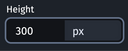
Heights should always be set in pixels.

Changing the height of an element may cause distortion. Make sure to test carefully and check that the rendering meets your expectations.
Background color
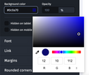
You can set or copy and paste the color code of your choice. Otherwise, click on the square to the right of the field. A pop-in will appear allowing you to select a color, or use an eyedropper (depending on your operating system, this window may be displayed differently).
Opacity
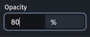
Set directly the opacity percentage you want. By default, the opacity is set to 100%. The more you decrease this percentage, the more transparent the element becomes.
Source or background image
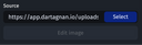
Click the “Select” button to select a visual from the media library to display it in the container. You can also directly copy and paste the hosting URL of the visual into the “Source” or “Background Image” field.
Below the “Source” field you also have an “Edit image” button which will allow you to crop the visual.
Alternative text
Set an alternative text here for the visual or video element, for example. This text allows you to display the message you want when the images don’t load. This will improve the accessibility of your email.

Content
Only valid for the button element, here you can define the button label.
Hiding an item on tablet or mobile
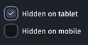
To hide an element on a tablet or mobile, simply check the corresponding box.