
Margins are available for image, text, button, and video elements.
Customizing margins
They let you apply space between the elements present within your email, and thus help structure it, optimize the readability of the content, provide visual breathing space and improve the hierarchy of information.
There is no universal value for margins, so feel free to apply the same margins to each type of element. For example, one margin size for the space between a title and a paragraph, another for the space between a title and a subtitle.
Part 1: Applying margins in the desktop view
To add margins to an element in the desktop view, select it and open the “Margins” category in the “Styles” tab of the design pane.
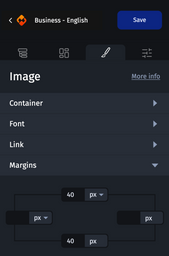
You can add margins above, below, to the right or to the left of your element.
Margins can be applied in pixels or percentages, depending on the rendering you want. In the desktop view, margins are generally applied in pixels to ensure the accurate rendering.
Part 2: Apply or modify margins in tablet and mobile views
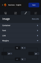
In tablet and mobile views, the margins are independent. You can modify these values without impacting those entered in the desktop view. By default, the margins are inherited from your desktop version and appear in gray color.
On these breakpoints, the margins are generally applied in percentages, in order to have an optimal rendering on all screen sizes.
Part 3: Background color case
When you add margins to an element with a background color, the margins keep that color.
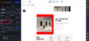
In this case, if you want to add a transparent (or white) margin above or below your element, you have two options:
- Add the margin to the previous or next element
- Use a Separator element
For more information about the separator element, please refer to Spacers.
Part 4: Margins vs. spacers
Margins are a key advantage for creating spaces, as they add less code weight (HTML/CSS) to the email. When they can be used, margins are recommended over the use of the spacer element.