When creating emails, it is common to want to arrange elements side by side in order to get a more dynamic and harmonious layout. The Email Builder lets you do this thanks to columns, allowing you to visually structure and organize the content.

Customizing columns
Columns can be added to groups, sections and slides of the slider, giving you great flexibility in the layout of your elements.
Creating columns
The method of creating and managing columns within these elements is the same. It is detailed below.
Creating columns from the Section element
To add columns to a section of an email,
- first select the section you want by clicking on it.
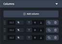
- This opens the Styles tab from the design pane. In this tab, you will find the columns category, which allows you to define the number of columns within the section.
You can add up to eight columns by clicking “+ Add column”.
For each column, you can specify its width as a percentage, allowing you to fine-tune its layout. Columns without a defined width are automatically calculated, and the value is grayed out in the field.

- Add the elements you want to the columns.


When you divide a section into several columns, it is no longer possible to insert an element spanning the entire width of the section. Content, such as text, is automatically placed in one of the columns created, and its width is limited to that of the corresponding column.

In desktop view, the sum of all column widths must always be 100%. To make this easier to manage, you can define a column with an “empty” width.
To facilitate column management, you can define a column with an "empty" width. The Email Builder will automatically adjust the width of this remaining column to ensure that the sum of the column widths is always exactly 100%.
This rule only applies to the desktop version.
Organizing columns
When you hover over the handle at the start of a line, or the “Duplicate” or “Delete” icon, the Email Builder highlights the corresponding column in the Designer, making it easy to quickly identify its contents.
You can also duplicate or delete a column. What's more, you can move and rearrange columns using the handles on the sides.
Managing vertical alignment in columns
In desktop view, as soon as you add at least one additional column to a Section, Group or Slide of the Slider element, you can customize the vertical alignment of each column's content. To do this, you can choose from 3 values:
- Align to top
- Align to center
- Align bottom
In tablet and mobile view, this option is only available as long as the columns are on the same line. If you place the columns one below the other, as explained in the next section, their height will adjust to the content of each of them, and this option will no longer be available.
To manage the vertical alignment of the column contents in tablet and mobile view, you'll need to integrate these contents into a group and define a height for this group.
Managing columns in the mobile version
It is possible to adjust the column widths for mobile and desktop versions independently, allowing you to optimize the layout for different devices without affecting the initial desktop version. Here's how to go about adapting the columns:
- Place the columns one below the other: To do this, assign a width of 100% to each column in the mobile view. This will align the columns vertically, providing a view suitable for smaller screens.
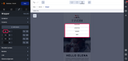
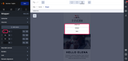
- Hide a column: To hide a column on the mobile version, avoid clicking on the trash can icon, as this will remove the column as well in the desktop version. Instead, set the column width to 0%.
Requirements
- In desktop view, the sum of all the column widths must always add up to 100%. To facilitate this management, you can define a column with an "empty" width. The Email Builder will automatically adjust the width of this remaining column to ensure that the sum of the column widths is always exactly 100%.
- Never assign a value of 0% or 100% to a column in the desktop version, as this could cause display problems, particularly on Outlook. If you want to integrate elements one below the other, you should not use columns.
- Decimal values are not allowed for column widths. Use only integer values to ensure optimal compatibility.
Further information
It is also possible to create columns using groups with a reduced width. This method allows you to design specific structures, such as:
- Column inversion: to swap the order of columns for a different visual effect. For more information, see Setting up a column inversion.
- Column double inversion: to combine two inversions for more complex and dynamic page layouts. For more information, see Setting up a double column inversion.
- One column in desktop to two in mobile: for more information, see Setting up a column to two in mobile.