A Button or “CTA” (Call To Action) is an element that encourages the recipient of your email to take an action. For example, it allows users to be redirected to a landing page when clicked (purchase confirmation, online content, forms, download of an application, subscription to a newsletter, etc.).

Buttons
Adding a button
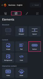
To add a button to an email, simply enter a section, group, background or slide, then go to the “Elements” tab in the design pane and drag and drop the button element in your email.
Adjusting a button
When you select a section and access the “Styles” tab in the design pane, you will have access to several customization options divided into 10 categories:
- Container
- Font
- Link
- Margins
- Rounded corners
- Borders
- Element Alignment
- Hover state
- Custom HTML attribute
- Dynamic content
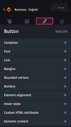
Each of these categories then gives you access to customization options.
Container
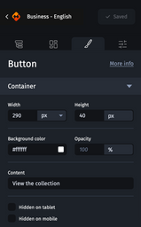
This category gives you access to the following options:
- Width allows you to customize the width of the button in pixels or in percentages compared to the width of the parent element.
- Height allows you to customize the height of the button in pixels.
- Background color to customize the background color of the button.
- Opacity to customize the opacity of the button.
- Content to define the label of the button.
- Hidden on tablet hides the button in tablet view.
- Hidden on mobile hides the button in mobile view.
Font
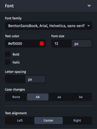
This category allows you to customize the look of the button label. It gives access to the following options:
- Font family allows you to customize the font used to display the button label.
- Text color allows you to customize the color of the button label.
- Font size to customize the size of the button label.
- Bold to format the button text in bold.
- Italic to format the button text in italics.
- Letter spacing to customize the spacing between the letters of the button label.
- Case change to customize the case of the button label.
- Text alignment to align the text to the left, middle or right of the button label.
Link
For more information on how the link option works, please refer to Adding links to an email.
Margins
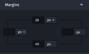
This category lets you customize the margins at the top, right, bottom and left, inside the Button element. They can be defined in pixels or in percent of the width of the element that contains the button.
Rounded corners and borders
For information on how rounded corners or borders work, see Customizing an element’s rounded corners and borders.
Element alignment
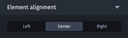
This category allows you to manage the alignment of the button on the left, in the center or on the right, within the element that contains it.
Hover state
For information on how the hover state works, you can refer to Customizing hover states.
Custom HTML attributes
For information on how custom HTML attributes work, see Adding custom HTML attributes.
Dynamic content
For details, please refer to Dynamic content.