With Email Builder, your emails are structured into sections that can contain one or more wrappers (or isolated elements) which can contain elements (texts, images, buttons, etc.). In this way, a wrapper allows you first and foremost to bring together elements (image, text, button for example) in a common block.

Wrappers
A wrapper is the equivalent of a table in an HTML layout.
Advantages of the Wrapper element
Apply a common style
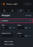
A wrapper allows you to easily edit parameters common to all the elements it contains (accessible from the “Styles” tab in the design pane after selecting a wrapper):
- Width
- Height
- Background color
- Opacity
- Options for hiding on tablet or mobile
Save time
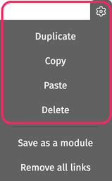
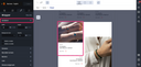
Another advantage of wrappers is that they let you duplicate or delete a set of elements quickly. When hovering over a wrapper in the email, the settings wheel provides access to several options:
- Duplicate
- Copy
- Paste
- Delete
Adding a wrapper
To add a wrapper to an email, simply enter a section, wrapper, background or slide, then access to the “Elements” tab in the design pane.
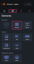
You can then drag and drop the “Wrapper” element inside.
For more information on the design pane, please refer to The structure of the Designer.
Customizing a wrapper
When you select a wrapper and access the “Styles” tab in the design pane, several customization options are available, divided into seven categories:
- Container
- Columns
- Rounded corners
- Borders
- Link
- Element alignment
- Dynamic content
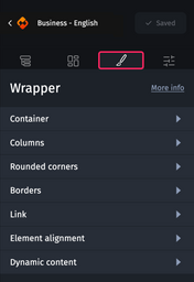
Each of these categories then gives you access to customization options.
Container
This category gives you access to the following options:
- Width allows you to customize the width of the wrapper in pixels or percentages relative to the width of the parent element.
- Height allows you to customize the height of the wrapper in pixels.
- Background color for customizing the background color of the wrapper.
- Opacity to customize the opacity of the wrapper and its content.
- Hidden on tablet to hide the wrapper in tablet view.
- Hidden on mobile to hide the wrapper in mobile view.
Columns
This category gives you access to the management of wrapper columns.
You can create up to eight columns and for each column and define its width as a percentage of the width of the element that contains the wrapper.
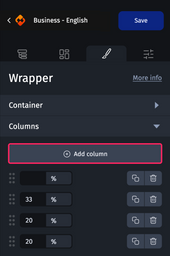
For optimal results in desktop view, it is imperative that the sum of the widths of your columns is always equal to 100%. The easiest way to achieve this is to leave one of the columns with an “empty” width, so it will be calculated automatically in order to always have a total of 100%.
This rule does not apply in other views. On the contrary, in tablet and mobile views you can, for example, set the width of all your columns to 100%. In this way, each column will occupy the entire width of the email, and their contents will be displayed one below the other.
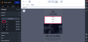
When hovering over a column, the Email Builder links the selected column in the Designer, allowing you to quickly identify the content.
You can duplicate  or delete
  a column. And you can also move them using the handles on the sides
  .
.
Adapting the columns in a wrapper on mobile view
By default, the desktop view takes over from the tablet and mobile breakpoints. However, the Email Builder gives you flexibility and customizability of display by differentiating your content between the desktop and mobile versions.
It is possible to change the width of the columns from desktop to mobile without impacting the initial desktop version. For example, it is possible to move columns one under the other in mobile. To do this, simply set the columns to 100%. Or display one column at 100% and the other two below.
You can also hide columns on tablet and mobile. To do this, simply change your column to 0%.
Rounded corners and borders
For more information on how rounded corners and borders work, see Customizing an element’s rounded corners and borders.
Link
For more information on how the link works, see Adding links to an email.
Element alignment
This category allows you to align the wrapper to the left, center or right within the element that contains it.
Dynamic content
There’s an article on how dynamic content works.