The “Background” element allows you to place editable content (group, separator, image, text, video, code) on a background image.

Backgrounds
One of its main strengths is its flexibility on mobile: unlike a classic image, you can zoom, crop or even replace the background image, offering more creative possibilities.

The background is compatible with all environments (Gmail, Outlook live, Outlook PC, Outlook Mac, Orange, Free, Yahoo, native iOS and Android applications).
The background is not clickable, only overlay elements on the background element can be clicked.
Buttons, sliders and background elements cannot be overlaid on the background.
Adding and customizing a background
There are many ways to create layouts with the background. These are the basic steps:
Step 1: Add a section for the background
From the “Elements” tab in the design pane, drag and drop a section into your email, and double-click it.
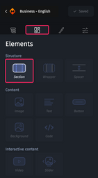
Then, drag and drop the background element.
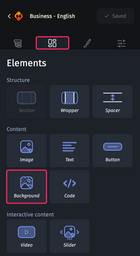
Step 2: Import the background for the desktop version
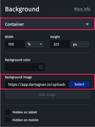
Click on the background, the “Styles” tab will open in the design pane.
In the “Container” category, you can import the image from the media library by clicking on the “Choose” button or by directly entering the URL of the image.
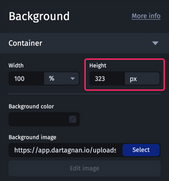
Step 3: Set the desktop background height
A background has a fixed height, so it is essential to set it for the desktop version. If the height is not specified, the image display may be cut off.
Determining the height of the image
If the image is already on your computer, you can check its height in the image properties, particularly in terms of dimensions.
If the image is not on your computer, here is how to proceed:
- Add an “image” element to your email.
- Import the background image as the source for this element.
- Hover over the image with the mouse: the dimensions will be displayed at the bottom left. Note the height, this is what you will need to use to set up the background.
Step 4: Choose the rendering and alignment of the visual
You can select how the visual will be displayed on the background using the Render and Alignment options.
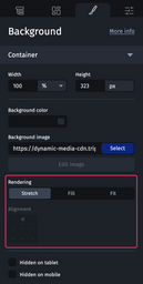
Stretch
This will distort the visual so that it is fully visible. This option is particularly useful when a color gradient is used as a background visual.
Original image

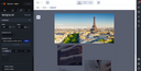
Fill
This will resize the visual while preserving its proportions in order to fill all the available space in the background element, even if some parts of the visual are no longer visible.
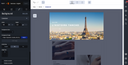
Fit
Resizes the visual while preserving its proportions so that it is fully visible in the background element, even if margins appear.
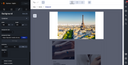
The alignment option allows you to simply modify the position of the visual when rendering is set to “Fill” or “Fit”.
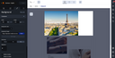
In tablet and mobile views, you can select the “Custom” mode, which allows you to go further in the way your visual is rendered and aligned.
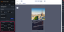
For further information, please refer to step 7 below.
These rendering and alignment options work with the majority of mail clients on the market. However, if you want your visuals to be compatible with Orange, GMX and Web.de mail clients, we advise you to use visuals with a width of 640px, and a height equal to the height of the content you’re going to integrate into the background.
Step 5: Add your editable elements to the background
Once positioned in the background, double-click on it. You can add the following elements by dragging and dropping them:
- Texts
- Images
- Groups
- Videos
- Separators
- Code elements
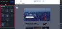
By default, editable elements are added and positioned on top of the background.
Elements superimposed on the background must not exceed/go beyond the image, otherwise they may be cut off.
Adding a button or CTA to the background
- Add a “text” element to the background
- Apply a background color.
- Adjust the line height.
- Add borders.
- Insert a link.
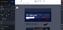
Step 6: Position Elements on the background
To adjust the position of elements overlaid on the background, go to the settings in the "Position" category.
Increasing the value of the top position moves the elements down.
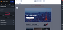
Set position settings in percentage to ensure optimal display results on all screens in a responsive mode.
Aligning the content
To align your elements to the right or left of your image, follow these steps
- Add a group to the background.
- Insert two columns into this group.
- Place the editable elements in the column of your choice.
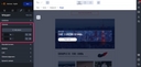
Spacing overlaid elements on the background
To create space between the elements, adjust their top and bottom margins. If you need to space buttons apart, use the "separator" element.
For more information on design and layout, please refer to The structure of the Designer.
Step 7: Adapt the background for the mobile version
The background provides several layout options for mobile views.
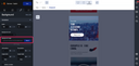
1. Choosing a different image for the mobile version
In the background image source, you can upload a new image specific to the mobile version.
2. Cropping the image
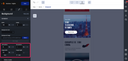
To adjust the background on mobile, use the crop options available in the Container category. Make sure the image is designed for cropping, without borders or legal notices at the bottom, for optimal adaptation.
The following settings allow you to customize the background according to the desired rendering for mobile.
- Horizontal position: to move the image from right to left.
- Vertical position: to love the image up and down.
- Image width: to zoom the image beyond 100%.
- Image height: to adjust the height to prevent distortion or crushing the image.
3. Displaying the entire image
For more information about setting mobile backgrounds, see Adapting the background for mobile devices.
Best practices
Ensuring the readability of the background
Set a background color for the background. Even if the images are not displayed in the mailbox, the elements will remain visible thanks to the contrast with this background color.
If you want to display the rendering of your emails without the media, click this icon.

What if the background doesn't display?
There can be several reasons for this. You may want to review them through a process of elimination.
In the Email Builder:
- Have you correctly entered the path to your background in the "Source" field?
- Have you correctly specified the height of your background in pixels?
After routing:
- Is the background URL correct, and not returning a 404 error?
- Does the background URL use "https"?
- Is the background URL properly replaced in the router's HTML code?
- If the URL is not replaced in the router code, you can copy/paste the hosting URL of the background directly into the Email Builder. Feel free to contact support if needed.