This tutorial will explain how to display, for example, two visuals aligned vertically on the desktop and display them in two columns on mobile. Note that we're using visuals as an example for this tutorial, but it works with any type of element contained in groups.

Setting up a column to two in mobile

1. Desktop view
Create a section with two columns.
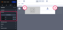
On the left columns, you can drag & drop your element.
On the right columns, drag & drop a wrapper.
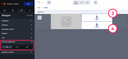
Inside the right wrapper, drag & drop two other wrappers. Inside each wrapper, drag & drop the element you will need. Then, right-align the first wrapper and left-align the second wrapper.
It is important to insert the two wrappers into a common wrapper, or your structure will not work in mobile mode.
2. Mobile view
On mobile, you can set the first columns at 100%.
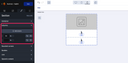
Then, for the first wrapper in the container menu, change the width of the group to 48%.
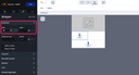
Do the same for the second wrapper.
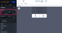
Keep a 4% gap between the two wrappers, otherwise there may be differences in Outlook.