This tutorial explains how to create a double column inversion.

Setting up a double column inversion
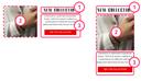
Double column inversion allows you to insert your left-hand column inside the elements of the right-hand column in mobile version, as in the example above.
When you create a standard block, the right-hand column will be positioned below the left-hand column, which is the standard responsive way.
1. Desktop view
In an empty section, create three groups one below the other
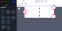
Then change the width of the first group to 50% and align it to the right. This is important to ensure that the process works properly.
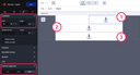
For the second group, change the width to 46% and align it to the left; it will automatically move up next to the left of the first group.
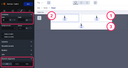
And for the third and last group, change the width to 50% and align it to the right, and it will automatically move to the right
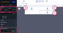
You absolutely need to have 4% of difference between your two wrapper – If you don’t have a total of 96% it will not work on Outlook.
2. Mobile view
The groups will automatically be in the right place and reversed. However, if necessary, you can move the groups by drag and drop. This will not affect the desktop display.
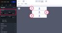
You can use column inversion to reverse the order of the images or any kind of content in these groups.