The goal of this tutorial is to explain different ways of adapting the mobile background according to your needs.

Adapting the background for mobile devices
Tutorial #1
Goal: The image will always be the same height, whatever the size of the smartphone is. There will be space between the right and left sides of the screen and the image. (Refers to the preview on Iphone 5, Galaxy S6-S20/ Huawei P9-P40, Iphone XS Max/XR/11/11 Pro Max.)
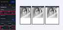
In the container area: Leave the width of the container at 100%. Don't change the height previously declared in desktop (in this case 320px), it's automatically adopted in mobile. So the background container will occupy the entire width of the smartphone with a fixed height of 320 pixels.
Background image settings: For the width of the image, select "auto", and for the height enter 100%. The background image will always be the full height of the display area, i.e. 320 pixels. As the width is set to "auto", the image will not be distorted and will retain its proportions.
Tutorial #2
Goal: The visual adapts to the width of the screen and therefore increases in height. (Refers to the preview on Iphone 5, Galaxy S6-S20/ Huawei P9-P40, Iphone XS Max/XR/11/11 Pro Max.)
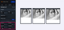
In the container area: Keep the width of the container at 100%. Don't change the height previously declared in desktop (in this case 320 px), it's automatically adopted in mobile. So the background container will occupy the entire width of the smartphone with a fixed height of 320 pixels.
Background image settings: For the width of the image, enter 100%, and for the height of the image, select "auto".
So the background image will always take up the full width of the smartphone screen. As the height of the image is auto, the image will not be distorted and its proportions will be preserved.
As the display area is in pixels, if the height exceeds 320 pixels, the visual will be cropped at the bottom.
Tutorial #3
Goal: The visual is 50% cropped at the top and 50% at the bottom. (Refers to the preview on Iphone 5, Galaxy S6-S20/ Huawei P9-P40, Iphone XS Max/XR/11/11 Pro Max.)
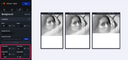
In the container area: The settings are the same as in the previous tutorial.
Background image settings: For the image width, enter 100%, the image height is set to "auto", and enter 50% in the vertical position field.
Tutorial #4
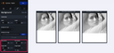
Goal: The visual is cropped at the top. (Refers to the preview on Iphone 5, Galaxy S6-S20/ Huawei P9-P40, Iphone XS Max/XR/11/11 Pro Max.)
In the container area: The settings are the same as in the previous tutorials.
Background image settings: For the width of the image, enter 100%, with the height of the image set to "auto", and enter 100% in the vertical position field.
Tutorial #5
Goal: The visual is not cropped and the display area adapts to the visual and not the contrary. (Refers to the preview on Iphone 5, Galaxy S6-S20/ Huawei P9-P40, Iphone XS Max/XR/11/11 Pro Max.)
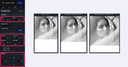
In the container area: Leave the width of the container at 100%, but set the height to 0 pixels.
Background image settings: For the width of the image, enter 100%, and for the height of the image, select "auto".
Position setting: Set equal values in the top and bottom positions in order to display the full image in the designer.
Note that the above tutorials are examples of optional adaptations. Each background has its own settings depending on your final objective.