After setting up your email for “desktop”, you'll need to configure the “tablet” and “mobile” versions. It's important to know which settings you can change without affecting the "desktop" version.

Independently modifiable elements on desktop and mobile
This article aims at providing you with an exhaustive list of the elements, values and styles that can be modified on the "tablet" and "mobile" breakpoints without affecting the "desktop" version.
1. What you can modify
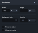
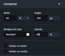
The container settings of your elements
- Width and height
- Background color
- Opacity
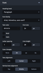
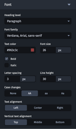
Font settings
- The font
- Style (bold/italic)
- Color
- Font size and line height
- Letter spacing
- Text alignment and vertical alignment
Layout settings
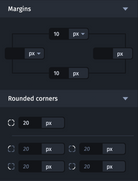
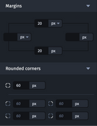
- Margins
- Rounded corners
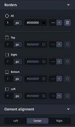
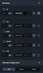
- Borders
- Element alignment
Background settings
- The background image
- Position
- Background color
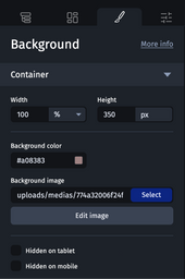
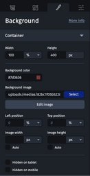

The background has additional settings in the mobile and tablet versions. If the background image is modified, the weight of this added visual will be included in the total weight of the email.
For more information about the background image element, see also Backgrounds and Adapting the mobile background.
Column settings
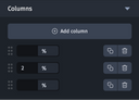
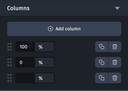
- Column values
If you would like a column to take up the entire width of the email, simply set the value "100%" in the relevant field. On the other hand, if you would like to hide it, simply set the value "0%".
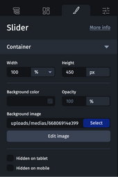
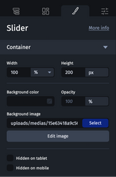
Slider settings
- The height of the slider
- Slider background image
2. What you cannot change
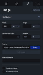
- Images
- Alternative texts
- Texts
- Heading levels
- Line breaks

To "force" line breaks without affecting other break points, feel free to change the width of the text container, or add margins.
- Styles applied via wysiwyg

- The order of the elements
If you modify text on mobile, it will also be modified on tablet and desktop versions. Similarly, if you add a line break or move an element to one of the three breakpoints, the change will be applied everywhere.
- Links and link titles
- Custom HTML attributes
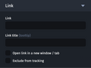
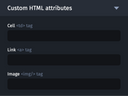
On the tablet and mobile versions, the settings can appear greyed out. This means that they have been copied from the desktop version but can still be modified. However, make sure that each field is correctly set to allow the email to be adapted.