Today, the majority of environments in which emails are read (email clients, webmail and mobile applications) have a dark mode feature. Almost all recipients can choose between a “light” mode (with dark typography on a white background) and a “dark” or “night” mode (dark background, light typography).

Effectively managing the dark mode in emails
It's important to note that “light” mode display environments remain the most prevalent on the market. Therefore, the goal should be to optimize the appearance in dark mode without compromising the classic version.
1. Behavior by email clients
Gmail – Application
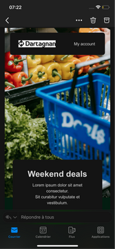
The Gmail application (available on mobile) can be set in light or dark mode. Depending on the mode activated, the email display will differ, with varying colors.
By default, if the OS (operating system) is in dark mode, Gmail will automatically switch to dark mode. Conversely, if the OS is in light mode, the application will remain in light mode.
In mobile, the Gmail application changes the color codes of elements (text, background color, button, etc.) from dark to light and from light to dark.

Gmail – Webmail
On the other hand, if you open Gmail in a browser (referred to as webmail), only the email interface changes. In other words, the content of emails in dark mode remains identical to those in the light mode: there is no impact.

Outlook Mac
Whether on a desktop or mobile environment, the Outlook Mac application changes the color codes of elements (text, background color, button, etc.) from dark to light and from light to dark.

Outlook 365
Whether on a desktop or mobile environment, the Outlook 365 application changes the color codes of elements (text, background color, CTA, etc.) from dark to light and from light to dark.

2. Behavior by elements
Color management
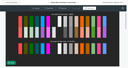
Color codes are inverted based on their contrast level in dark mode.
The more a color is seen in light mode, the more it tends to invert to a darker shade in dark mode: On Gmail, white (#FFFFFF) is inverted to #202124.
Dark mode behavior in Gmail and Outlook
Text management
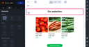
Texts are also contrasted according to their hexadecimal color code.
Light mode – Designer
Dark mode – Outlook

Image management
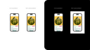
The display of images is identical in both light mode and dark mode. Whenever possible, crop images with a colored background to ensure it does not appear in dark mode.
Logo and icon management
The display of logos, icons, or pictograms is the same in both light mode and dark mode. If the display in dark mode is not optimal (e.g., the logo or icon is not visible), add either a colored background or an outline. The background will not be visible in light mode (e.g., a white background on a white email) but will make the icon stand out in dark mode.
Color by color, Outlook 2019 and the Gmail application in the cases explained above will therefore fetch the opposite value when switching to dark mode. Only the color codes are affected, which can cause problems of legibility and contrast in relation to your images (which are not affected).
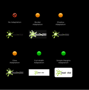
Text management on background elements
It is possible to optimize background images during the design phase to maximize the readability of overlaid content in dark mode (particularly when there is light text on dark images, or dark text on light images).
Why is it important to anticipate this?
As mentioned earlier, images do not change in dark mode, but text colors do. Thus, in light mode, dark text on a light image will become light text on a light image in dark mode, making the text potentially unreadable.
How to ensure a good display during the design phase?
Incorporate a gradient opacity into your background image. This gradient slightly improves readability in light mode and significantly enhances it in dark mode.
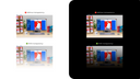
Once the image is inserted, all you need to do is enter a background color (behind the image). For example: adding a light background color into the background element will automatically convert to a dark color in dark mode, ensuring better contrast and readability for the text.
Light mode – integration of background element with gradient
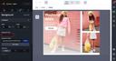
Dark mode – Outlook 365

A golden rule: check and test
Messaging platforms handle dark mode differently, and they interpret the HTML code of your emails in varied and evolving ways. Therefore, there is no universal solution for dark mode compatibility but rather a set of best practices.
We strongly recommend to always check how your emails are displayed on different messaging platforms, if possible in real-life conditions by sending a test email (BAT) from the Email Builder and another test email (BAT) from your Email Marketing Software.