
In the Designer, you can view the rendering of an email at any time on a smartphone, tablet, or computer.
Using the desktop, tablet and mobile views
Switching between views
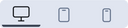
To switch between views, click one of the three icons at the top of your screen.
These renderings are previews that are based on breakpoints that correspond to the various devices on the market:
- Desktop 640 pixels (default value, editable - can be modified)
- Tablet 500 pixels
- Mobile 320 pixels
Customizing the width of an email in desktop view
When creating a blank email, the Email Builder sets the email width to 640 pixels.
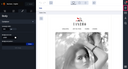
You can change this setting by clicking on the “Styles” tab from the design pane, and then entering a value between 540 pixels and 1024 pixels in the “Campaign width” field. For the desktop version, setting the width to between 600 and 700 pixels has proven to be ideal.
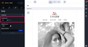

If you would like to change the default value, please contact your account manager. This saves you from having to change the value for every email you create.
Viewing an email in other screen sizes
To get a more detailed preview of an email, simply click on the mirror link icon in the validation workflow pane.
From the “Mirror link” pane, click on the “Open in a new tab” button. Please note that the email must be saved before you can access the buttons.
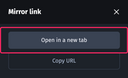
A new tab will then open in your browser, allowing you to preview the email in different screen sizes.
For more information about the mirror link, see Using the mirror link.